Tuesday, 14 January 2020

Barbara Hepworth

Image result for barbara hepworthImage result for barbara hepworthImage result for barbara hepworth


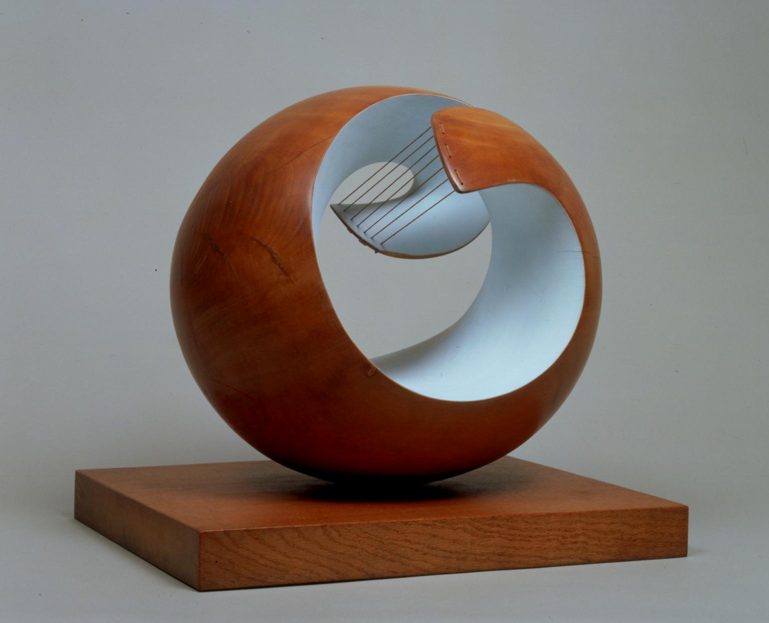
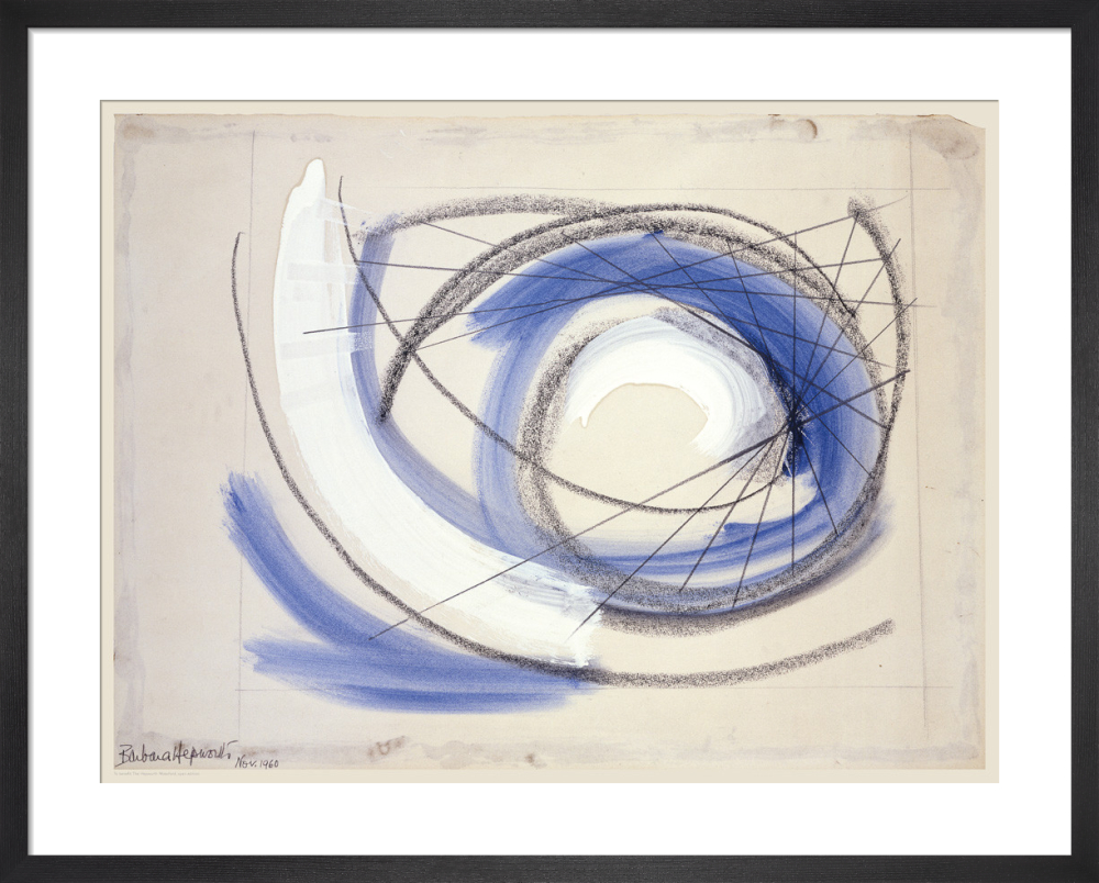
I like Barbara's work as she has neat-looking sculptures that look carefully-made. The forms she's created are interesting and give a feel of new dimensions. There's some negative space being created which makes new shapes. Also, I like the concepts she has made. For example, the one below. She has meaning behind all the sculptures and I like how her work's been thought out yet seem a little abstract. I like the curved lines because they dont always have to be perfect straight lines.

Image result for barbara hepworth

Journey Artist Research

Julian Opie

In my research I have found an artist that I really like, Julian Opie. I like their work as pop art can be considered old and modern. Their main art is pop art. However, they've also done photo prints and digital work. Their digital work includes animations that experiment with real-life objects which are then used and animated with realistic movement (most likely used with reference from his own images). His work is also minimalistic, which is nice as the idea of journeys can be minimalistic, and I like showing a little but telling a lot at the same time. The crisp look of Julian's work is really calm to look at and therefore I plan to achieve that type of smooth appearance by doing my work on an illustration programme. I also may consider using white and black acrylics to make grey tones. The portraits he has done were produced digitally which gives them clean lines.

Monday, 13 January 2020

Research on animators


Image result for studio ghibli


Studio ghibli

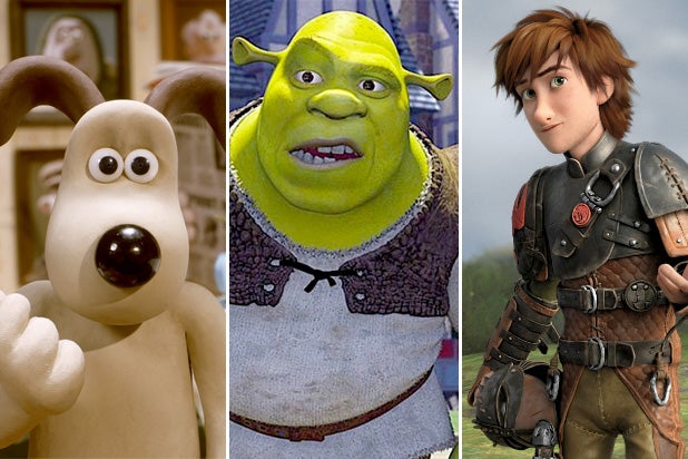
Studio ghibli uses a 2D software programme. They try to achieve 24fps in order to make the animation a bit more still, creating steady motion which is still smooth enough to look as if characters and objects are moving. This is common with Japanese animation.


Image result for dreamworks animation


DreamWorks pictures

DreamWorks use 3D animation, 3-dimensional animations are typically 60fps to get the ideal smooth animation. They also use CGI. I like their films and work as they are really good with colour schemes and pathetic fallacy.


Image result for Tex Avery cartoons

Tex Avery

This American director did a series of traditional animation. Some include "Jerky Turkey" and "Red hot rangers". Most of his animations were in 20-30fps.


Pendleton Ward

Image result for pendleton ward cartoons
Pendleton Ward is an American animator who worked to create Cartoon network shows such as "Adventure time".


Image result for tim burton animation typeTim Burton

This animator tends to do stop motion animation. His animations are popular for having smooth stop motions and some CGI.


Monday, 16 December 2019

Abstract Art pt.2

This piece of art was produced by Salvador Dali. I like this as it has a balanced composition, I believe it has a a balanced composition as on the left side we are given melted clocks on a big block of some sort of dry material. Then on the other side there's a massive void, which creates contrast in colour, that feels deep and so compliments the heaviness on the opposite side. "The persistence of memory" (title of the piece) was done with oil paints. This impacts on the communication of the artwork by making texture organically. Oil paintings normally have a crisp effect due to the fact that the paints are quite dry. Then this makes the painting we see (below) appear sharp as if the artist could vividly remember this in their head, leading any viewer to think that the artist wanted us to see their idea in a higher quality so that we can also remember the image. This is most likely because they wanted their visual to be clear even if the meaning behind it isn't.

Museum of Modern Art New York USA
http://greensurrealism.pbworks.com/f/clock.jpg


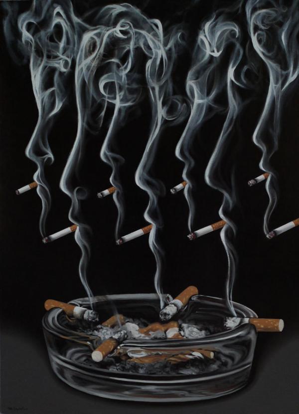
Another artist's work that I like is "Perpetuance of vice" by Mihai Criste. I am really into the negative space that shows due to the cigarette smoke. I like the tone of colours being used as the image feels calm. Scale-wise, they've added variety in the sizes of the cigarettes which makes the painting less boring. The painting also has good use of dynamic lines (formed by the smoke). Mihai also uses oil paints (like Salavador). I think their outcomes are both equally high quality and look as if they used careful applications of the brush.
https://artuk.org/discover/artworks/summertime-number-9a-117801

https://www.cuded.com/2012/01/surreal-paintings-by-mihai-criste/


Abstract Art


Image result for bridget riley art
http://www.op-art.co.uk/bridget-riley/
Op Art was around in the 1960's. Op art, also known as optical art, was pioneered by artists like Bridget Riley and Victor Vasarely. It had the purpose of creating an illusion to the human eye and making the image look as if it's moving. Shapes, colours and patterns could be put together to create optical illusions.
Bridget Riley, ‘Fall’ 1963
https://www.tate.org.uk/kids/explore/who-is/who-bridget-riley

Fauvism occurred in the early 1900’s, it only lasted a few years though. The artists that were associated with this movement included Henri Matisse. A piece of their art is below. This art movement was trying to achieve very saturated colours (which came from emphasising expansive fields of colour) fauvism uses non-natural colours. For example, the blue on the woman's skin for shading.

Cubism also occurred in the early 1900’s, and began in Paris. This movement was led by Pablo Picasso. Its purpose was to go break some rules of traditional art. Below is a creation by Picasso himself.
Pablo Picasso Cubism | Harlequin - Pablo Picasso - WikiPaintings.org Picasso Portraits, Kunst Picasso, Art Picasso, Picasso Cubism Paintings, Picasso Collage, Georges Braque, Henri Matisse, Commedia, Synthetic Cubism
https://www.pinterest.co.uk/pin/419608890254150846/


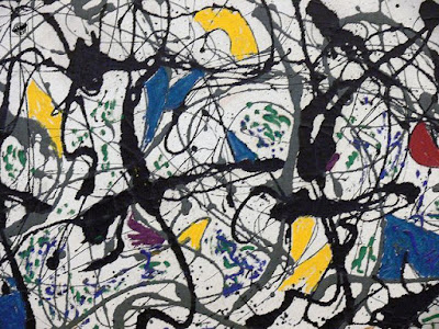
Abstract Expressionism happened in the 1940's. It was a world war II art movement that wanted to influence internationally. To produce abstract impressionism, you had to apply small brush strokes in order to paint an "impression" of the reference you preferred. An example of this is shown below, this piece was created by Jackson Pollock.
https://en.wikipedia.org/wiki/The_Deep_(painting)


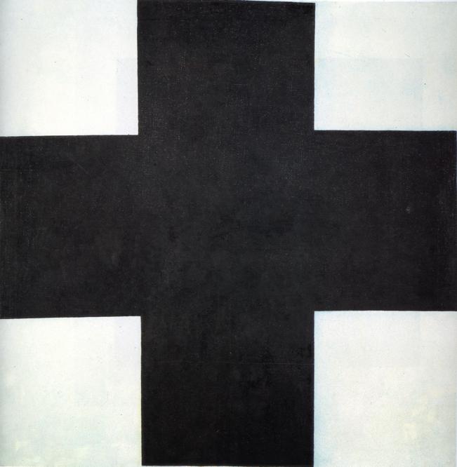
Suprematism was found the the early 1900's and was developed in 1913 . This movement focuses on geometric shapes and forms and the use of them to create basic compositions. The piece below was created by Kazimir Malevich.

Futurism first occurred around 1909, this movement was based in Italy. The goal of futurism was to show new technology and the beauty of its speed. Originality was a huge thing and was to be showed through this art movement. Christopher Richard Wynne Nevinson has previously doen abstract art before, here is one of them below:
https://www.tate.org.uk/art/artworks/nevinson-the-arrival-t00110
Dadaism started around WWI. The aim of this was to go against modernism and logic. This went against modern society and was to make artworks with more reason. Soon enough this led to people using propaganda to challenge others and create symbolic works. The reference below was done by Euardo Paolozzi.
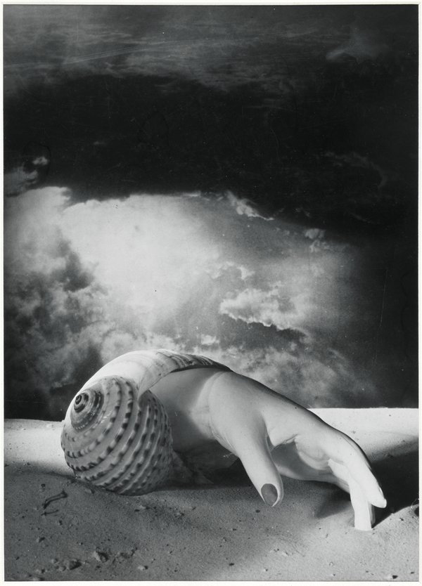
Surrealism occurred in the 1910's. The purpose of surrealism was for others to convey their creativity on canvas with next-to-no-limits. This movement influenced art, literature and culture. Surrealism involved the imagination to be used and lets others apply what they have seen, dreamt about, ever thought of, and allowed them to feel as if their strange thoughts could potentially become an amazing piece of art as deranged ideas are interesting.
https://www.tate.org.uk/whats-on/tate-modern/exhibition/dora-maar

Monday, 18 November 2019

Self portrait thoughts

I think it would be a good idea to start doing my self-portrait in black and white first. Working on a grey scale would be more suitable as I don't find myself good at using colour straight away. More so, I lack the confidence in shading with colours.

Peter Doig
“Blotter”
Made in 1996. This piece is particularly interesting to me as I really like the imperfect line art. I really enjoy doing messy type of sketches, but my work is not neat on accident. However, this art work seems to have been done it in this “sketchy” way on purpose (hence why it’s called blotter, like blots on the page). The lack of colour variation appeals to me as nothing stands out more than the other. Also, I feel as if the focus is in the middle of the drawing. I find this to be quite cool because there’s only one person we have to look at. This, as well as the background being filled with trees and no creatures, creates an image of loneliness but since nature is with the figure it then gives us a sense of the
weather/what the person would feel like in that situation. I want to produce a portrait in 2D and have it inspired by this, and another art piece. The other one will be:
“Reflection”
This was done in 1997. This creation was intended to be abstract but also have recognisable features, so it is meant to look like a reflection (like the title). With this, I’m going to use it as a reference and do something in a similar style and make my art more realistic. I will also most likely do a reflection at some point, literally (with a mirror) and also metaphorically (with an object that can-do reflection/have them looking at a clone of themselves). I find this to reveal identity in a dramatic way as the image can look as if it is telling a story. Most images do, all images have different stories whether it is short or long. Both this image and the “blotter” one has been taken from Tate.co.org.uk
Glass Symbolism
Glass could symbolise invisible protection, it could also symbolise fragility. The material is very fragile and therefore I may use it in my work to do a subtle identity reveal. I am normally very gentle with objects and art equipment I am given so I think it would be interesting to draw things as glass.